


An experimental tool to understand the world.
Get Started for FREE
Sign up with Facebook Sign up with X
I don't have a Facebook or a X account


 Your new post is loading...
 Your new post is loading...
Your new post is loading...
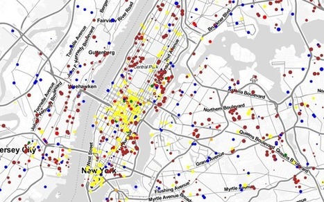
Watch the commuting patterns of New York, San Francisco and Los Angeles. 

Paul Nicoara's curator insight,
May 5, 2013 5:05 PM
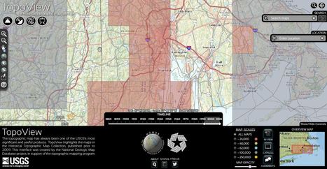
The National Geologic Map Database is a simple interactive tool to find USGS topographic maps that you can dowload. Users can search for current or historic maps.

A new clickable atlas shows just how far it is to the grocery store, everywhere in the United States. "Food deserts" are the focus of state, local and federal anti-obesity efforts.

Dean Haakenson's curator insight,
March 15, 2013 1:23 PM
Great for looking at agriculture issues in the US and the debate over the local food movement v. supermarkets.
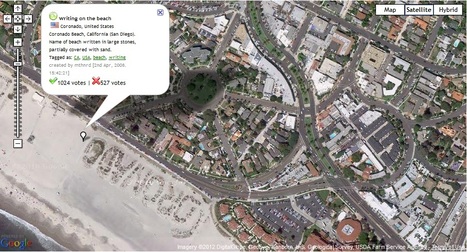
This site "Map of Strange" is dedicated to showing strange things that can be seen in Google Maps. Displayed here is a beach that I loved to go to growing up in San Diego. Coronado is written in large stones on this part of the beach right next to the red roof of the famous Hotel Del Corondo.
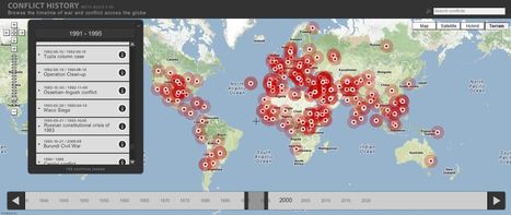
Browse the timeline of war and conflict across the globe.
This database of global wars and conflicts is searchable through space and time. You can drag and click the both the map and timeline to locate particular battles and wars, and then read more information about that conflict. This resource would be a great one to show students and let them explore to find what they see as interesting. This site is brimming with potential.

olsen jay nelson's comment,
August 16, 2012 7:46 AM
This is just what I've been looking for, believe it or not:-)

Paul Rymsza's comment,
August 22, 2012 2:15 PM
the potential of this site is amazing between the interactive learning system and the correlation between the timeline and location. If the human geography class is anything like this i can't wait for it!
|
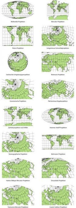
Elizabeth Borneman explores how cartography and cartographic projections help and hinder our perception of the world. "How do you think the world (starting with our perceptions) could change if the map looked differently? What if Australia was on top and the hemispheres switched? By changing how we look at a map we truly can begin to explore and change our assumptions about the world we live in." Geography doesn’t just teach us about the Earth; it provides ways for thinking about the Earth that shapes how we see the world. Maps do the same; they represent a version of reality and that influences how we think about places. Tags: mapping, perspective.

samantha benitez's curator insight,
November 22, 2014 2:53 PM
helps show the different perspectives of our world and how it has changed. also shows many different forms of mapping our world throughout time. 
Emily Coats's curator insight,
May 27, 2015 10:34 AM
UNIT 1 This article discusses map projections and how they shape our perception of the world. Maps influence how we see the world, and could change the way we see it as well. These projections show us many different views of the Earth, which is very influential to our perspectives. This applies to unit 1 and its major concepts and underlying geographical perspective such as analyzing maps.

Fantastic mapping tools, each with brilliant interactive ways for students to get involved and literally put themselves on the map in new and exciting ways!
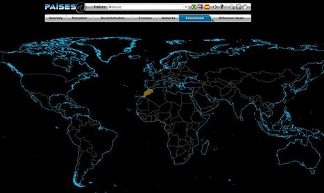
The Brazilian government's geographic department (Instituto Brasileiro de Geografia e Estatística-roughly equivalent to the U.S. Census Bureau) has compiled an fantastic interactive world factbook (available in English and Spanish as well as Portuguese). The ease of navigation allows the user to conduct a specific search of simply explore demographic, economic, environmental and development data on any country in the world.
Via sofilab, pa3geo
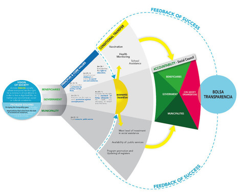
My classmates and I are in the Design for Social Innovation program because we identified problems in our communities, companies, or cultures and are keen to figure them out. But before talking about any solution or outcome, one must first frame the problem—by thoughtfully examining the system it’s part of to understand where and how to get involved. Learning to use systems thinking, a holistic approach to problem solving that emphasizes contextual understanding, has helped me with team management, project planning, creative work, and even relationships. And for wicked problems like healthcare that confront business, nature, and society, it’s proving to be imperative.So, where to even begin? “We have to invent boundaries for clarity and sanity,” advises systems thinking pioneer Donella Meadows. Sometimes a simple infographic works to tell the story. Designing visual maps and models helps us immediately find connections and describe relationships. Creating models helps in seeing the big picture and one's place within it. Via Lauren Moss, michel verstrepen

Martin (Marty) Smith's comment,
January 28, 2013 7:14 PM
I think "design" and "programming" are rushing at each other at light speed. Web pages will be made from branching if,then,else algorithms soon. Can't just drip paint on a canvas, so design's function will be making those algorithms make visual sense.

Gordon Shupe's curator insight,
February 8, 2013 6:38 AM
Info graphics don't really include digital photography, generally, but they are a fascinating way of displaying understanding, telling a story, and implying solutions.

On myHistro you can create advanced geolocated timelines that you can play as presentations. Pin your events, videos and photos to the map and share them with friends and family.
This new resource, myHistro, combines interactive maps with timelines to organize stories, journeys or historical events as the move over time and place. By embedding photos, videos and links this creates an incredibly dynamic platform for telling historical and geographic stories. By combining these features, this is a powerful tool to create customized resources for you students. Pictured above is a sample timeline that shows the spatial and temporal journey of the Olympic torch for the 2012 Games. Via Seth Dixon, go social studies go

benjamin costello's curator insight,
May 20, 2015 5:38 PM
Interesting concept but not totally fleshed out for use by historians... genealogists perhaps would have a better or easier time using this program. It is very interesting but it only allows for one movement, so rather than showing the history of a nation you can show the history of a family through its interactive timelines. Google maps is not always accurate as well.
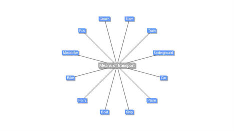
Text 2 Mind Map es una aplicación web que te convierte al instante un listado de palabras u oraciones en un mapa mental; interpreta lo que tú teclees y a partir de tu input dibuja un mapa mental. No necesita ningún tipo de registro, es tan sencillo como acceder a su web, teclear el vocabulario que desees y pulsar el botón Convertir en mapa mental, Convert to Mind Map. Via EduKPress, EduClick_España, maria cristina ALCARRAZ VIGIL, juandoming
|


I think this is an interesting representation to show how the ability to have access to news and internet is the new most important thing to have to get word out. Now if you can speak English and have a computer with internet access you can.
This map allows people to understand the flow of news from around the world. We can use it to see where and what is happening and chart it to connect trends for example Syria and France are large because of the recent happenings with terrorists and terror attacks.
Intro